Turia CSS
Why does this project exist?
I can do pixel perfect designs if you tell me what you want, but designing from scratch is a bit hard for me — color selection, spacing, composition…
I know it’s the part that closes the development circle, but I haven’t dedicated the time it deserves yet. What I have done is research tools (I’m passionate about finding tools) to make my designs more harmonious and consistent.
That’s how I discovered Tailwind, Bulma, DaisyUI, Shadcn, Bootstrap, Open Props, Pollen, Ant Design, and many, many more. They all have something to offer, but they all have a trade-off that doesn’t quite convince me.
Tailwind is very practical, you quickly start seeing results “without writing a single line of CSS”, but you end up with messy HTML as the project grows.
I came to the conclusion that what I like is reusing classes, but what I was missing was a ready-to-use spacing and color system. Open Props is a great example of this, but it has design decisions I couldn’t quite understand, like --size-000. Building a CSS design tokens system is very complex — making everything make sense is a big challenge, especially having all the values in your head while developing, or at least being able to deduce them with a few simple rules. That’s the real challenge.
With Turia CSS I don’t know if I’ve achieved it, but at least I’ve tried to contribute my take on the subject.
Here’s the idea:
Sizing
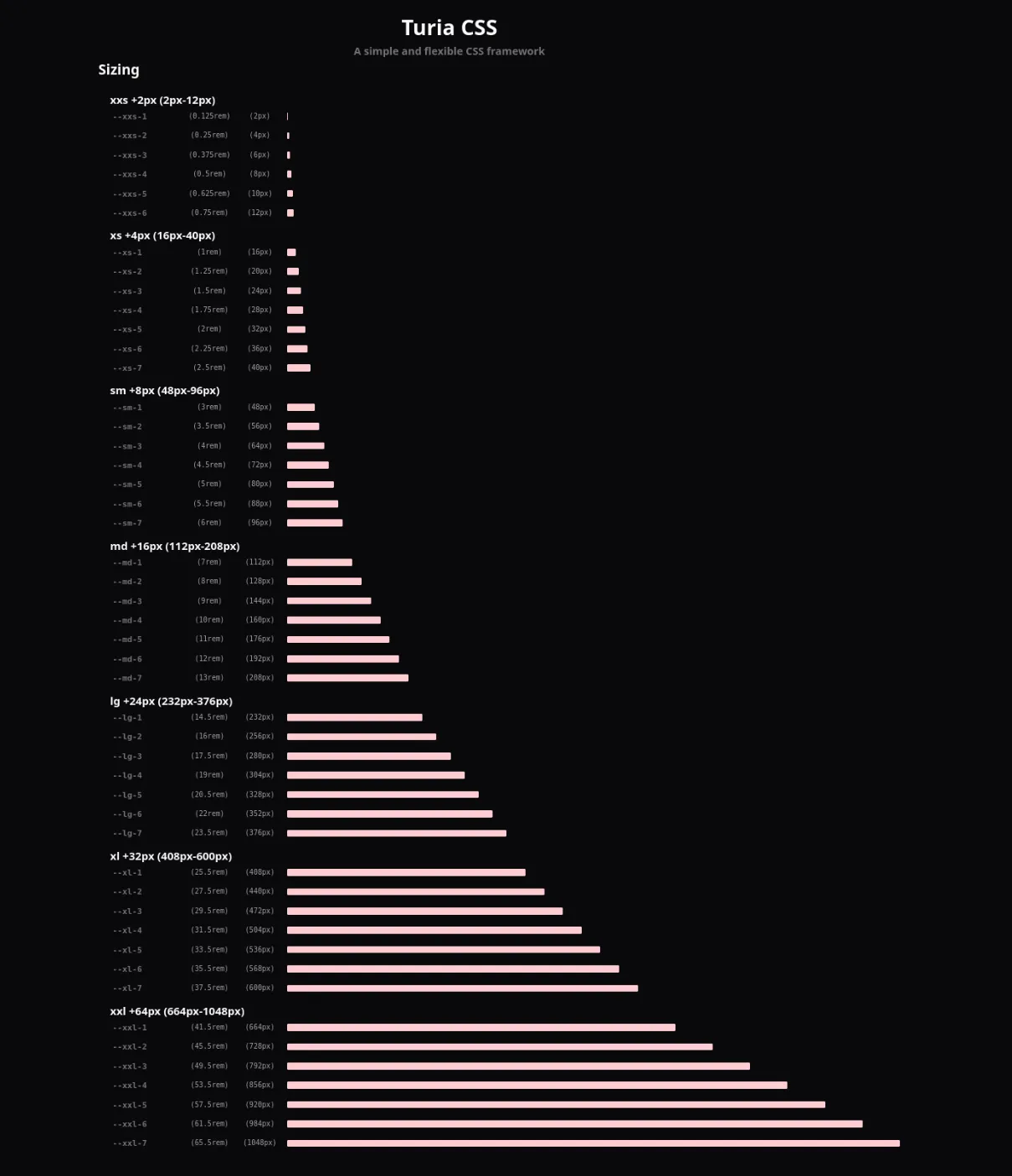
The main idea was to cover all possible sizes you might need when building a design.
To do this, I split sizes into 7 scales with 7 multipliers each, needing to remember “only” 2 things: the base step of each scale and where it starts.
For example, the sm scale starts at 48px with a step of +8px. So with that scale I can adjust in 8px increments. The reality is you’ll always try and try, but the result is a size scale with a harmonic and predictable distribution.
Colors
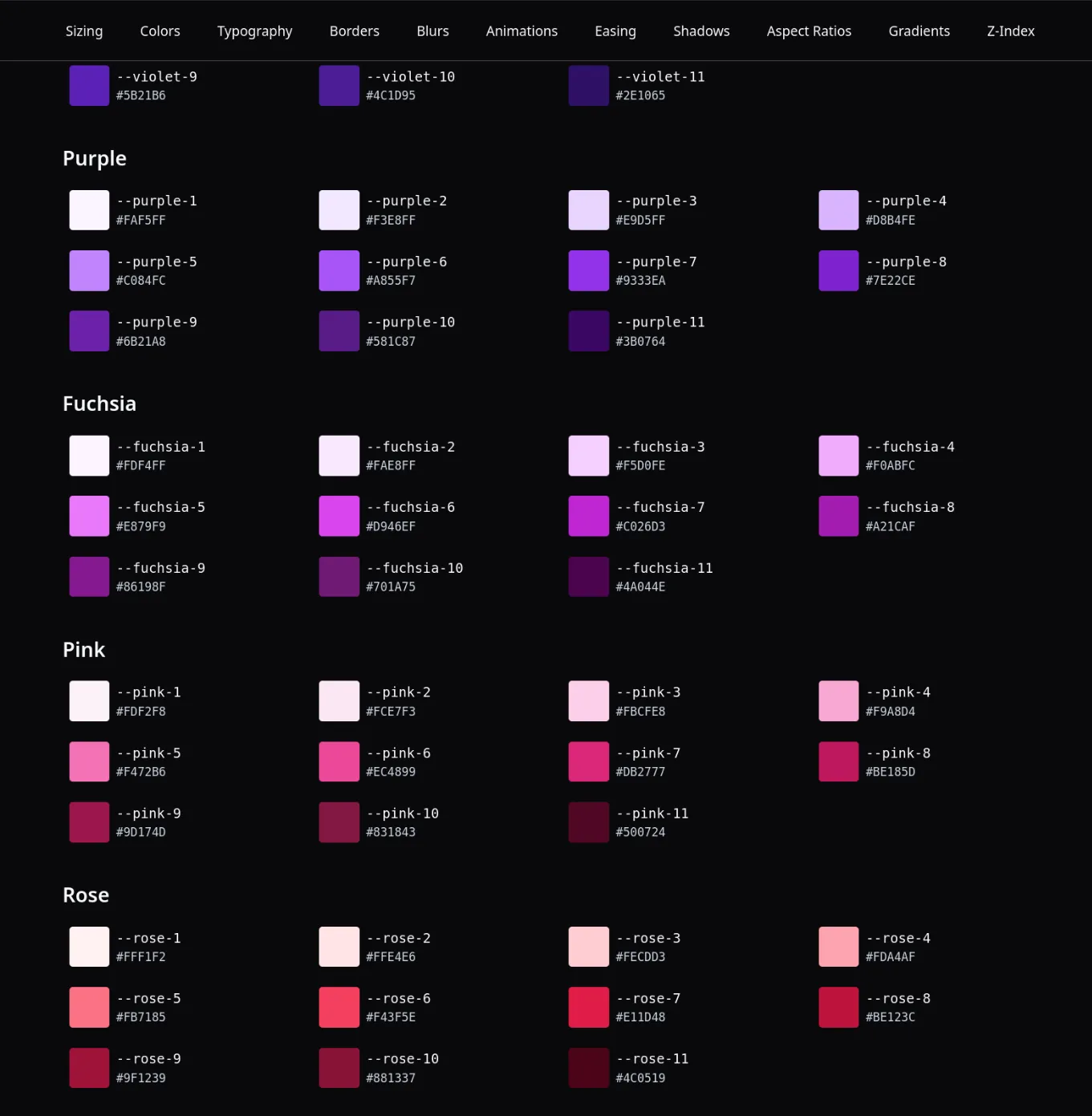
For colors I took inspiration from Tailwind and Open Colors, but with a different color selection with more contrast between tones.
Extras
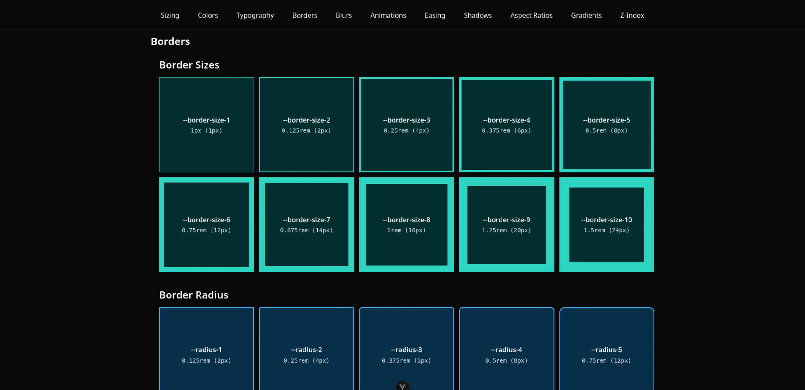
Besides sizes and colors, I also added other categories like typography, shadows, borders, animations, opacity, z-index, blur, gradients, grid and aspect-ratio.
Building the library took me quite a while, but the hardest part was maintaining the coherence and logic behind each value. One of my biggest challenges was the choice of colors and sizing. Ultimately, with a lot of work, I think the result produces harmonious and meaningful designs.